As business owners, we are all looking for ways to increase sales and overall foot traffic to our storefront. Especially when it comes to owning a brick and mortar, your sales instantly stop the second you lock the front door. Imagine if you could be making sales with the doors shut and the closed sign up... eCommerce is the solution!
Salon Specific
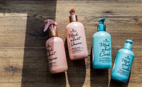
Let us talk about your salon. Think about your customer base, specifically your regular clients...How often are they visiting? If I had to guess, they are probably coming in about once a month. When it comes to the one off clients maybe once every three months. The reason I want to get you thinking here is because of the time spent away from your salon. They are clearly using beauty products whether it is shampoo + conditioner to face wash and hand cream, so why not provide them with these products. These clients come to you wanting to feel their best! They are going to take your advice as you steer them in the right direction. Also, they are more likely to buy products from you after a great experience! They will want to increase longevity of the satisfied product. Keep this in mind especially with stores like Target, Sephora and Amazon where such products are so easily accessible. If they do not want to buy products immediately after their treatment, it would be wise to provide an option for them to do so before they come back and see you, eCommerce! Afterall, without an online shopping cart to directly buy beauty supplies from, they will mostly end up on Amazon Prime. While it may seem tedious and time consuming, believe me it is not all that complicated. I have laid out a few important categories to help you maximize your online potential!
Increasing Sales through eCommerce
How many followers do you have on Facebook or Instagram? Imagine each of those followers making an average of two purchases a month from your store. You can literally turn your social following into an extra stream of revenue by incorporating an online shopping cart. They already follow you, so why not post merchandise and give them two clicks to make it theirs? Not to mention, the folks from out of town will be able to purchase your inventory from their couch miles and miles away. Lastly, the incorporation of this shopping cart will inevitably drive foot traffic into your store. For example, I am browsing Instagram looking for Christmas gifts, I then see your post of a new fur sweater or face cream. My mind immediately starts thinking, what else does this store have to offer? If I purchase the fur sweater for my mom, maybe I can grab something for my sister too... Hypothetically, I buy both on Instagram - they arrive to my house and everyone loves the new swag! They ask me where I got it, and now we are all headed to the brick and mortar. Yes, that may have seen like a silly story but guess what? It happened last week!




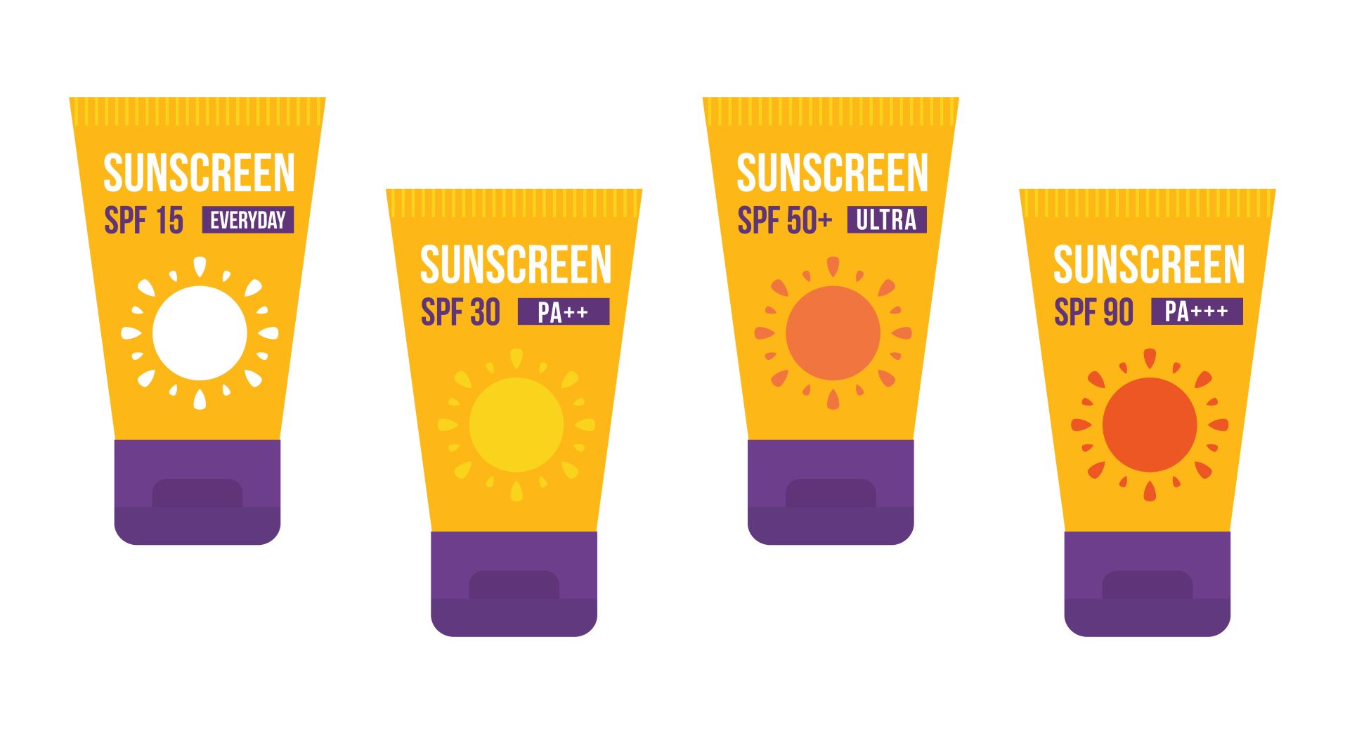 SUMMER is HERE! It is time to enjoy the beach, go on vacation, and have fun in the sun. So, pack that SPF Sunscreen. It is HOT out there, share your professional sunscreen knowledge.
 DON’T BE SOUR LIKE A LEMON . . . USE THOSE LEMONS TO MAKE LEMONADE!
.jpg?width=3000&name=guilherme-petri-602659-unsplash%20(1).jpg)

 Success in Beauty, The Secrets to Effortless Fulfillment and Happiness is a revolutionary book written by a variety of women about how to be happy and fulfilled with little or no effort at all!
